One of the primary marketing tools of a business in an urban environment is its exterior presentation. Unlike in the burbs, where one may have to travel a distance before reaching a new store—and then will most likely go in even if it looks beat since they have gone through the trouble of getting there—in urban areas, foot traffic is high and a nice looking presentation or something that grabs attention will be remembered. Of that exterior presentation, signs are one of the most important pieces of this puzzle (aside from what can be seen in the windows if there are any).


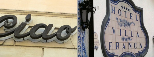
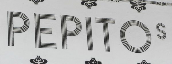
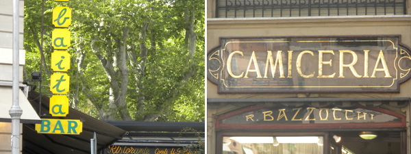
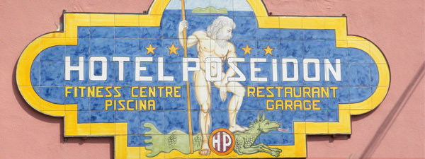
In Rome and its surrounding environs, great care is taken to make the signage feel custom, have an impact and are made with artisan care. In many instances, this is achieved through the use of local artisans painting tiles or hand lettering the business name. In the instances where the signs were made in more of an American style, with structural lettering, impact was created by using a material that contrasts with the building façade or by raising it off the surface and putting a spotlight on it to create a shadow or lighting effect that was really striking. The most conspicuous absence however was the use of neon or signs with interior illumination.

The number of businesses that used signs with integrated lighting—that flickered and winked at you in the night, that had letters “go out” changing the store name to a dirty word—were surprisingly few. Perhaps it is due to a difference in cultural sensibilities, it could be the result of strict zoning rules or the Italians may have noticed that the added cost of electric for their signs is not offset by a proportionate increase in business. Whatever the reason, the Romans have mastered the art of standing out without glowing in the dark.
~ben
Sign up for our informative newsletter filled with helpful branding and marketing tips.


© Elements 2024. Elements is a registered trademark of Elements, LLC.

