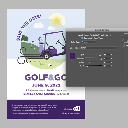
Color 101

Color can be confusing; with different methods, modes and lingo, it can be tricky to know what’s best to use when. Let’s break down the basics:

Pantone (aka PMS)

Use: offset printing

The Pantone Matching System (PMS) is a universal color language used by designers and printers. Created in 1963, it revolutionized the printing industry as a tool to select, discuss and reproduce consistent colors anywhere in the world. How it works: colors are organized through a proprietary number system and chip format, and are physically selected by viewing the chips in-person, not on-screen.

There’s a collective experience of having marketing materials printed at various times from various printers, all with different outputs; working with high quality printers, processes and Pantone colors can fix that. The upside to Pantone colors is absolute consistency. The downside? Not just any printer or print method can produce Pantone colors; it takes a more sophisticated process such as offset printing, which costs more. However, the price your brand may pay for not presenting itself consistently is an inability to build strong brand recognition and an overall messy appearance, which could lead your audience to believe you lack attention to detail.

CMYK

Use: digital printing

CMYK stands for:

  • C = cyan
  • M = magenta
  • Y = yellow
  • K = black

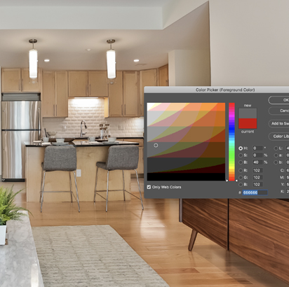
If you’re printing a smaller batch of materials, need a quick turnaround and/or are looking to cut costs from offset printing, a copy shop or smaller print shop with digital printing capabilities may be your best option. However, digital printing uses CMYK colors, not Pantones. There are many different CMYK color spaces for different sets of inks, papers and printer characteristics, which effect the finished look. CMYK colors are selected digitally so you won’t see how they actually look until they are printed; reviewing hard (physical, not digital) proofs from the printer is vital to ensuring you’re satisfied with the colors, and that they’re consistent with your other marketing materials.

You could have the same brochure printed five different times from five different printers and even in five different countries (as we did with PEZ Candy) — or even the same printer but at different times — and get five different results (i.e. the colors look slightly different).

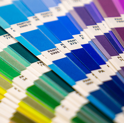
This is why the Pantone Matching System was created, and why it’s preferred by designers; it relies on exactly matching the color off the press to the Pantone chip no matter the printer.

However, tight budgets, small quantities or deadlines may make offset printing with Pantone colors out of reach; digital printing is still a completely acceptable option and has come a long way in quality since it was first introduced, but keep in mind it may require some tweaking and multiple proofs to get the output just right.

RGB

Use: web / digital

RGB stands for:

  • R = red
  • G = green
  • B = blue

There are many different types of color spaces that use the RGB mode, but generally speaking, RGB was developed for the creation of images and graphics to be viewed on-screen only, never for print.

Takeaway

This brief breakdown barely chips the tip of the iceberg of all the ins and outs of color, but we hope it helps clear up some common confusion as it relates to your marketing. Main takeaway: reach for Pantone / CMYK when printing, and stick with RGB for digital. It’s helpful to have a design team on your side to ensure consistency, resolve issues, select colors, communicate with printers and advise — give us a shout! 203-776-1323 or amy@elementsdesign.com

—Amy

Share on facebook
Share on twitter
Share on linkedin
Share on pinterest