Be Full-Filled Wellness

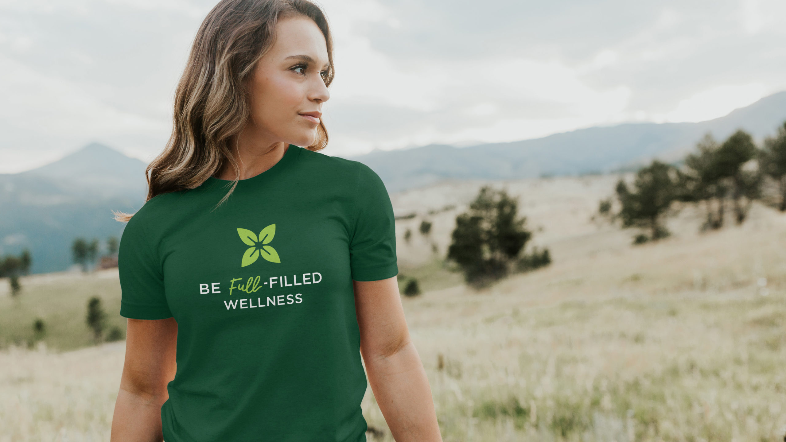
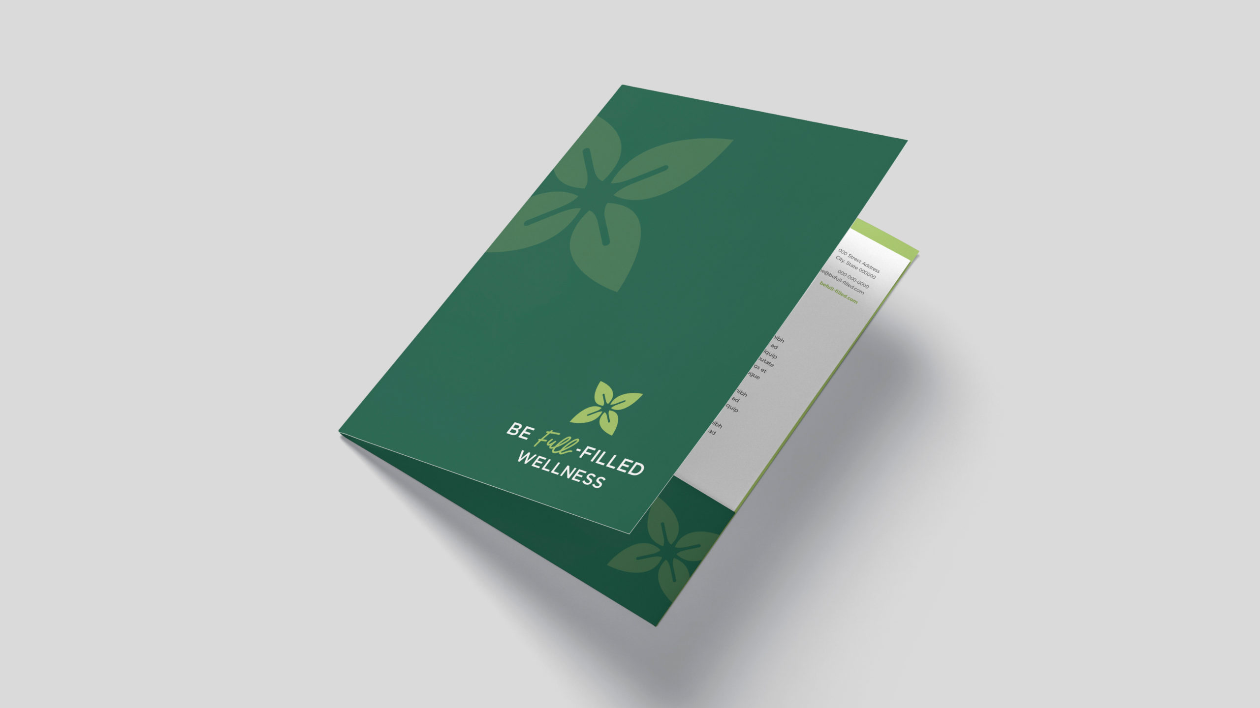
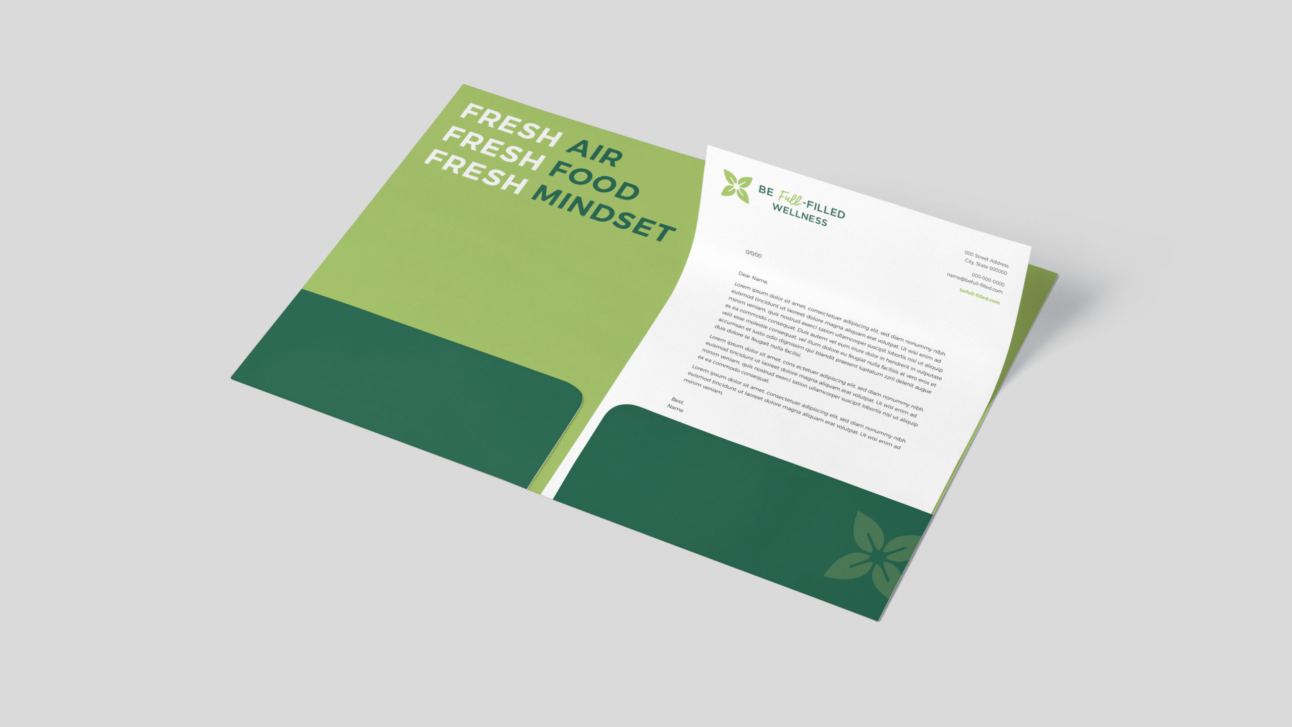
Be Full-Filled Wellness is a health coaching business based on living a positive lifestyle with nature at its core. The fresh air, fresh food, fresh mindset mantra helped shape our creative strategy for an approachable brand that resonates with a wide range of audiences looking to live life to the fullest.

Objectives

The budding health coaching business approached Elements with a name, mission and clear vision for the brand, but no identity. With deep roots in nature, we were determined to design a visual representation that reflected mindfulness and connection to the natural world that felt personal to Be Full-Filled’s owner, yet appealing to a wide audience.

Solution

After exploration, conceptualization and rounds of revisions to get the shape, fonts and colors just right, we reached the final design that features a bold leaf mark that plays with positive and negative space to breathe energy into the design. “Full” is graphically emphasized in a contrasting hand-drawn script, giving the logo a bespoke touch without lacking bold personality.

Results

We followed-up Be Full-Filled Wellness’ logo design with a brand guide, including preferred logo usage, print and web fonts, and a color palette to be used as a reference for all future marketing projects — setting the new business up for success!